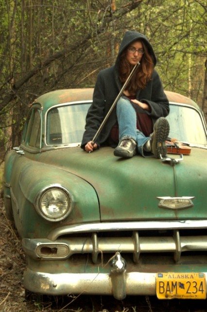
An important thing to consider while doing portrait photography is depth of field. In short, the area of the image that is in focus. You can get depth of field in a variety of ways that I may cover in a later post but the simplest is simply by adjusting your aperture to a large size (smaller number) or a small size (larger number), the larger the aperture i.e. 1.4, 2.8 etc. the less depth of field you will have in your image. Portraits are usually focused on the person as your subject and thus they are typically what you want in focus with the eyes being your primary focus point.
Now that we have talked about the usual way we get the DOF we want lets look at how you can use photoshop after you have gone home and realized you didn’t get enough of a blur on the background and it is still too distracting. I am no expert in photoshop and so I will leave the full step by step process to someone else (there are plenty of writings on this if you search Google). Basically what you are going to do is this:
- Open your image in Photoshop
- Duplicate the layer
- On the bottom layer go to Filter>Blur>Gaussian blur
- Set the blur to a level that is not too overdone but removes the background distraction
- On the top layer hit edit in quick mask mode
- Use the brush tool to highlight the area that you want to blur (just paint with a black color, to erase paint in white)
- Exit quick mask mode
- Go to Layer>Layer Mask>Selection
- At this point you should see your image almost the way you want it
- While highlighting the mask in the layers pallet go back and brush any edges that don’t look right, it helps to experiment with brush hardness and opacity to get the edges to look natural.
- Save your new image and marvel at the difference.
That is a very basic list of the steps involved, my intent was to only inform you of the possibilities when your equipment alone cannot give you the results you would like.
Bellow are some images I edited in about 10 minutes to highlight the effect.


i actually think i like nonblurred… it pops out more and the contours of the branches are neat to see clearly.
the foreground does pop out more though…